
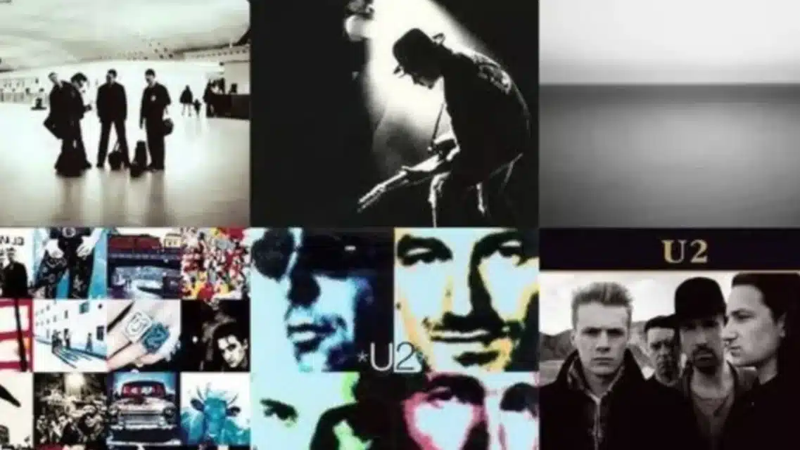
The creative process and stories behind the iconic visuals that defined U2’s iconic albums.
Stephen Averill, known by his stage name Steve Rapid with the band The Radiators from Space, is widely regarded as one of the most respected album cover designers in history, largely due to his long-standing collaboration with U2.
I asked Stephen to tell me about five of his own favourite covers.
He picked U2’s Boy cover from 1980 as still being his favourite one because it was his “first step into getting some recognition”. “I was a young Dublin-based designer and, I can tell you, the record company were not particularly pleased that the cover was being done by somebody outside of their arena,” he recalled.
The American label even shied away from using the now iconic cover because it was a photo of a topless boy.
“We did it in the UK and then the first thing I heard about the American sleeve [being changed] was when somebody showed me a copy of it,” he recalled.
“And I was told that it was largely a worry from the American side of things that the image would be seen to have paedophile connotations. I don’t think there would have been a controversy over there.
“But people forget now, this was their first album. So anything that’s deemed to be detrimental to the band succeeding is something that you move away from.
“Once the band was successful it subsequently reverted back to the cover that we all know with Peter Rowen on the cover.” Peter, who funnily enough is a photographer himself these days, was reportedly paid in Mars Bars by his older brother’s mate to pose for some of the initial snaps.
“I just got the contact sheets of those pictures and I immediately honed in on this image,” Stephen told me.
“And I thought, ‘This is a superb image. It will just make that very immediate eye contact when somebody picks up an album cover’. “They’ve got these eyes looking at you and it’s intense. It draws you in. You want to know more about what’s going on. So, that’s why I picked that shot.”
Stephen used Peter again on the War album cover, along with several singles and the first Greatest Hits collection. “Although we had talked about and tried several different things, he just seemed to be the right face for War and it made a certain continuity with it,” he said.
“The one in the middle of that – the October cover – is possibly more what a band would have on their debut album cover: a picture of the band and title fairly clear. “I’m also very happy with the War cover. It portrayed what we were trying to do.”
How did Stephen first meet U2?
“My brother was in the same class as Edge in Mount Temple School and he came home one day and told me that these guys in school were in a band and wanted to talk to me about my experiences with The Radiators,” he said. “So all my initial contact was with Adam [Clayton] and we just talked a lot about ideas and what might work and might not work, and what they should do and what they shouldn’t do, and so on.
“The initial contact was about advice rather than anything to do with graphics.“It was only later that they asked me if I would do their first poster and first single cover.”
Stephen also worked his magic on Whipping Boy’s second album Heartworm, which given the 25th anniversary reissue special treatment with deluxe CD and vinyl editions a few years back. Incidentally, it is my my all-time favourite Irish album.
“We just took some of the ideas in the music and tried to create an album cover that reflected what it is,” he said. “My main goal for any album cover is to reflect what the music is about. So when you see the cover it’s like a lead-in to the music.
“Again, an awful lot of this album cover belongs to the photographer I picked for it, Brendan Fitzpatrick. Brendan took these photographs on the front and back cover in a heart-shaped broken mirror, which tied in with the Heartworm title.
“I thought the music was great. It’s very hard to know what music will stand the test of time. But I certainly feel the cover image stands up today. It could’ve been designed today. The music stands up today – it could’ve been recorded last week.”
Stephen went over to New York to work on the cover for the album Each Man Kills the Things He Loves by Gavin Friday and Maurice Seezer. “It was photographed by Anton Corbijn in a backroom of a club with a jukebox and a piano,” he said. “What was odd about that cover was being in New York in that era you would think that it would be quite easy to find a couple of models who would pose.
“In the left hand side of the cover you see this couple dancing, unclothed there. “But trying to get people to do it proved to be quite a difficult thing to do, because for some reason the various model agencies didn’t want to put forward anybody for it. But we eventually found a couple.
“And it’s very innocent, it’ not supposed to be in any way titillating. It’s just simply a part of the scenario that you see in this particular room.”

Stephen was also commissioned in 2001 to do a cover for a certain Liverpudlian named Declan Patrick McManus, who is very proud of his Irish roots.
“When Elvis lived in Ireland we worked together on, I think, five or six album covers with my team in the office,” Stephen said. But the one Stephen picks [When I Was Cruel] was Elvis’ first album to feature The Imposters band.
“This was one where he was working in Windmill Lane and he invited me down to the studio and he played me five or six tracks from the album. “He said, ‘Now you’ve heard those, go away and come up with an idea that might suit’.
“And about a week later I went back to see Elvis and I said, ‘Look, there’s five images here. One I think is ideal for this album cover.
“And I won’t tell you which one it is. You have a look and choose which one you like’. “And he went through the photographs I had picked out and he said, ‘This one’. “And I said, ‘Turn it over’. And it was the one that I had marked, which was taken at a fairground in London.
“It’s of these two sort of insect creatures that are part of the fairground ride and I just thought it really summed up the attitude of When I Was Cruel.
“It was just like a complete juxtaposition of the title and this very humorous cartoon imagery of it.” Stephen came up with the concept for their second album Ghostown. Both Roddy Doyle and Joseph O’Connor consider it as the best Irish album of all time.
But Stephen can’t officially take credit for that one because he wasn’t the actual designer on that album released in 1979. He had stayed behind in Dublin to focus on the daytime job when the band immigrated to London. Stephen wasn’t hands on with Ghostown simply because it would’ve been impossible to do it with only fax machines to work with in those good old days.
Instead, he sat down with the guys and showed them the Nosferatu movie.
“I said, ‘That would make a great album cover image. But if you’re going to do it, don't use a still from the film, recreate it with the shadows’,” he said. “But why I chose the Trouble Pilgrim American edition is because we released that album four times. I changed the album cover for each edition.”
There’s an Irish, English, Japanese and American edition. He added: “Philip had said to me, ‘I have a series of VHS recordings of a TV show called The Dark Dark Hours’. It was almost Twilight Zone-ish.
“He said, ‘In this particular episode Ronald Reagan plays the doctor and James Dean is the bandit. “We both felt this idea of James Dean as the punk hero and Ronald Reagan as the Establishment, which was quite an interesting image to use’.
“I then tracked down James Deans’ photographer Dennis Stock and asked for permission to use the image. He gave his permission, but we got blocked by other users of it. “So, I re-photographed the image from the TV screen because it fitted our ethos of a television screen.”
The distorted image was a nice nod to their first album TV Tube Heart. “And the American record company said, ‘That’s great. Let’s go with it.
Let’s not worry about the fact that it’s got Dean and Reagan on the cover. Most people won’t recognise them anyway’,” he said.
“We finally got to do the idea we had come up with originally for the very first edition, the Irish edition, which we weren’t able to do at that point.” Finally, the cover for Trouble Pilgrims’ really good album Blood, Glass & Gasoline is very striking with its two dancing skeletons.
“I had taken these photographs in San Francisco where they have a Mexican area very much related to the Day of the Dead,” Stephen concluded. “That was actually a water drain in San Francisco. There were shadows and trees above it.
“So I just took an image of it, because I like the idea of Day of the Dead: you celebrate the fact that you’re alive and you celebrate that death is coming. “It just seemed to make a good image for the album title and name of the band.
“The funny thing is: do you see the yellow dots on the bottom of the cover? That’s actually the platform of Connolly station. I just photographed it one day when I was standing there. “That’s the grounding of the record – that’s making sure you don’t slip off the tracks. “So, that’s why that’s there – as a counterbalance to the San Francisco image.
“So, there’s a little bit of Dublin and a little bit of somewhere else in it.” There’s also much more than just a little bit of the much-missed and irreplaceable Philip Chevron at the heart of it all.
The album has a wonderful nod to Philip’s song Under Clery’s Clock with a reference to the famous Dublin landmark on one of their new songs. There’s also, if you look closely enough, a clock design on the back cover.
The new album still retains the same punk spirit and energy that inspired Stephen and Pete Holidai of Trouble Pilgrims fame to start their first band The Radiators with late, great Philip Chevron.
There’s still plenty of gasoline left in their tank.

